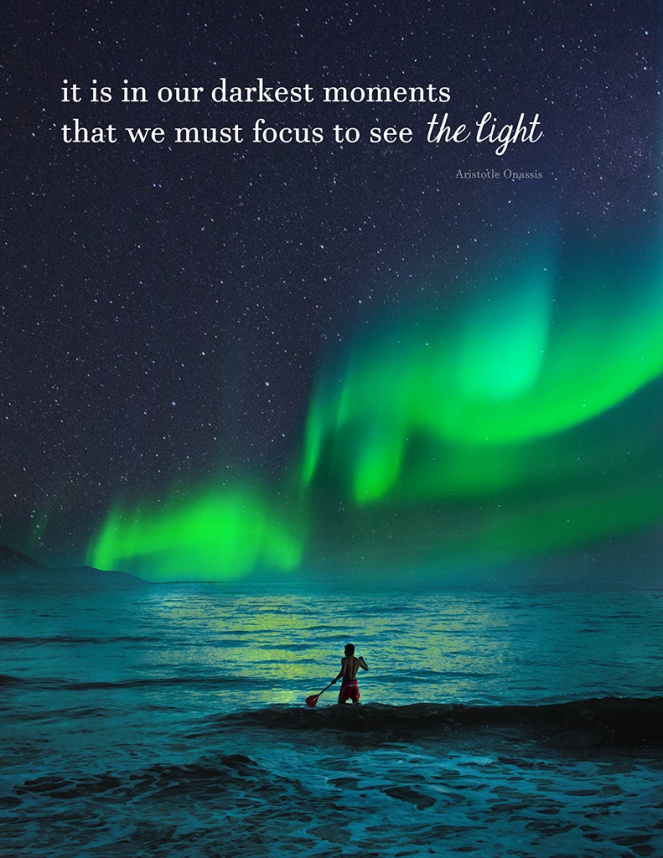
- Description: An inspirational montage created by blending three images together with the use of typography.
- Process: My background image is the man standing in the water. I cropped it down to 8.5″x11″ and placed the photo of the Aurora Borealis on top of it. I created a layer mask on that layer and painted black over it, making the bottom disappear. I decided I wanted more stars visible, so I put another photo on top of that, changed the layer setting to “lighten”, created a layer mask and painted away the stars from the water. I also changed the opacity of the brush and painted over the Aurora Borealis so the green would be more prominent. I finished by typing out the text and finding two fonts that worked well together.
- Message: The message of this piece is to focus on the happy, light things, even in the darkest of times.
- Audience: Anyone who is need of an uplifting message, perhaps religious people who believe in spirits or a higher power.
- Top Thing Learned: I learned how to use layer masks to easily “paint” away parts of an image I don’t need without completely destroying pixels.
- Filter / Colorization used and where it was applied: I used the Selective Color tool on the water to bring out more green, as if the water was reflecting the light of the Aurora Borealis.
- Color scheme and color names: Analogous – Indigo, Blue, Teal
- Title Font Name & Category: Javanese Text (oldstyle, serif)
- Copy Font Name & Category: Janda Elegant Handwriting (script)
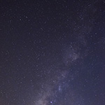
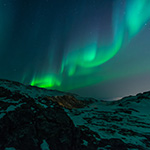
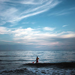
- Thumbnails of Images used:
- Sources (Links to images on original websites / with title of site): One, two, three

Your montage is awesome! I absolutely love the pictures you used, and they look so good together. Your message is very clear, and your picture fits perfectly with your quote. Excellent job!!
LikeLike
Hey Sarah! This is such a creative montage! I seriously didn’t even imagine it was 3 different images. You did a great job meshing the pictures together in a natural way. It’s interesting how you made the green lights reflect in the water. SO creative! I really like the quote too and how the message comes across. Here’s a link to Dain’s blog: https://dainknudsonblog.wordpress.com/2016/02/12/project-4-montage/
He did an awesome job with blending the images as well!
LikeLike
I think your piece is amazing! I love that you put the focus on the words “The light” in your text to make it match with the northern lights. I love that you tied the text into the image so well. And I love the merging of your images, I can’t quite tell where one image ends and another begins and I think it’s amazing! Your blending is very well done. And I love the complementary type fonts. I also really like the white font to make it pop on the dark background. You should check out these blogs!
https://breannegibb.wordpress.com/2016/02/14/192/
LikeLike